 MegaMegaTypeType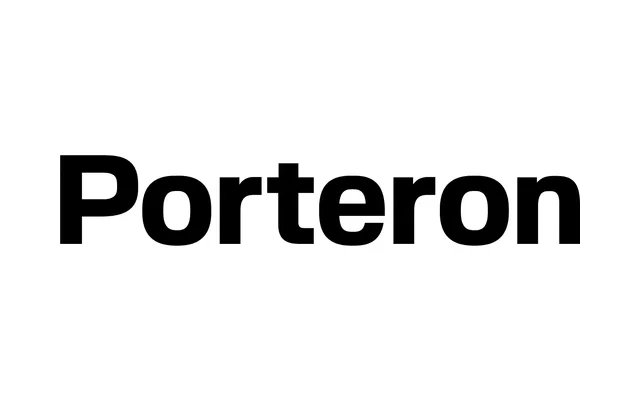
A disciplined geometric sans-serif with squared contours and rational curves, designed for editorial and branding work across five weights with full italic support and a variable font axis.
About
Porteron is built on controlled geometry, its squared terminals and compact-but-open proportions giving it a technical neutrality well suited to layout-heavy work. Five weights span from Regular to Black, each with a matching italic, and a variable font covers both weight and slant axes in a single file. It has been used in real identity projects including Studio Mass's Melbourne Recital Centre branding and Merantix Capital's visual identity by CRU.
Classification
Squared contours with smooth rational curves; disciplined geometric construction with restrained contrast and steady rhythm. Variable font with weight and italic axes. Technical-neutral character, closer to geometric than humanist despite its warmth.