 MegaMegaTypeType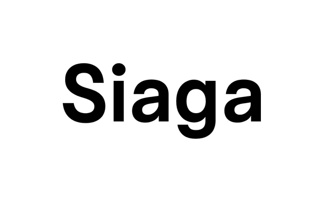
A proportional geometric sans that channels monospaced modernist aesthetics across seven weights, 14 styles and a variable font covering both weight and italic axes.
About
Siaga began in 2015 as a bespoke typeface for Studio Weidemüller's visual identity before being comprehensively redrawn over four years into a full retail collection. Its even spacing and clean terminals carry a clear debt to monospaced modernist type, giving the family a metrically consistent colour from Thin to Ultra while remaining proportional throughout. OpenType features include four stylistic alternates, oldstyle and tabular numerals, a slashed zero and standard ligatures, making it capable across display and extended text settings.
Classification
Proportional geometric sans drawing openly on monospaced modernist traditions. Even stroke contrast, restrained terminals and consistent apertures produce a mechanical evenness without the rigidity of a true fixed-width face. Sits in the neighbourhood of DIN and Eurostile in spirit, but lighter and more refined. Not monospaced – the foundry's own description frames it as preserving proportional widths while referencing the aesthetic.