 MegaMegaTypeType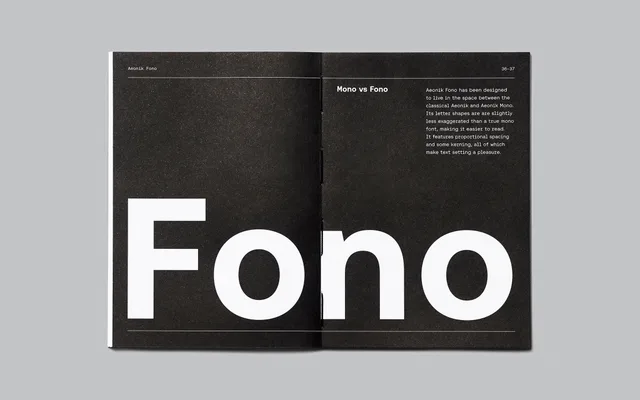
A proportionally spaced geometric sans that borrows the visual language of monospace type without the typesetting constraints.
About
Designed by Mark Bloom as a direct extension of the Aeonik family, Fono achieves the tight, even texture of a code font while retaining proportional spacing and proper kerning. Closed apertures, perpendicular terminals and elongated serifs on narrow characters like i and l carry the mono aesthetic into branding and editorial settings. Stylistic alternates extend its range further: boxed and circled numerals, character variants for a, f, y, J, Q, 7 and &, plus three sets of arrow glyphs.
Classification
Proportionally-spaced geometric sans engineered to read like a monospace. Closed apertures, perpendicular stroke endings and elongated slab-like serifs on i, j, l and I generate the even visual rhythm of a code font. Spacing and kerning remain fully proportional, so it avoids the typesetting friction of true monospaced type.