 MegaMegaTypeType
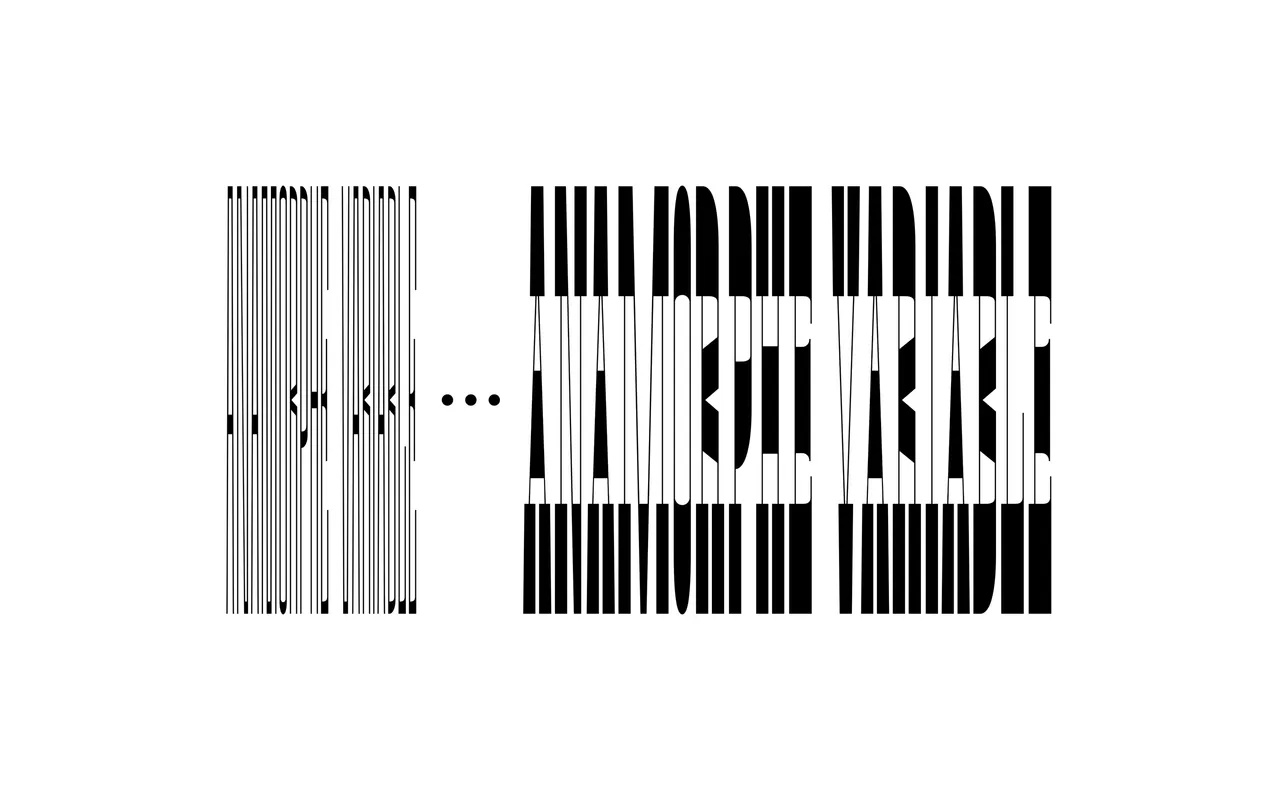
A variable display face by Anselm Felter that revives 19th-century anamorphic lettering, stretching words until they can only be read at an extreme angle.
About
Anamorphe is the more cryptic sibling of Manoeuvre, drawn from the graphic riddles collected by ephemera collector Richard D. Sheaff, now held at Letterform Archive. One variable font runs from 200 to 700 in weight and 100 to 300 in width, so a hidden message can be tuned to fit its space; set two phrases across each other in a grid and each reads from its own direction. Angular and round details sit side by side, the narrowest styles are sans and grow serifs as they widen, and a stylistic set adds the ball terminals found in some historical samples.
Classification
A variable display face built on perspective anamorphosis: letters are stretched so far across the width axis that words only resolve when viewed at a steep angle. It is a sans at its narrowest and grows serifs as it widens, so it sits outside the usual sans and serif labels.