 MegaMegaTypeType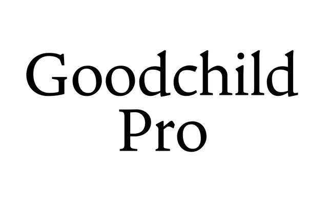
A Jenson-derived text face from Shinntype with a large x-height and clean, contemporary detailing suited to academic and scholarly setting.
About
Where most Jenson revivals opt for rangy proportions and antiqued finishes, Goodchild Pro takes a more pragmatic path: a large x-height, tight fit and modulated stroke contrast stay close to the original letter forms, while Jenson's diamond periods and tiny tittles are abandoned in favour of crisp, decisive details. The result reads well at text sizes and holds its own when used at display scale. The family covers four styles – Regular, Italic, Bold and Bold Italic.
Classification
A Jenson revival with a large x-height and contemporary finish, retaining tight fit and modulated stroke contrast from the Renaissance archetype while shedding antiqued details for clean, decisive forms.