 MegaMegaTypeType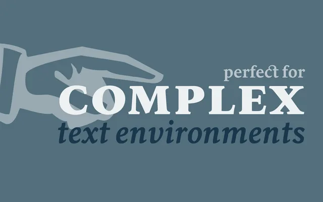
A low-contrast humanist serif by Nicolien van der Keur, designed for demanding text environments including dictionaries, academic publications and novels, with full IPA, Greek and Cyrillic coverage.
About
Sirba keeps stroke contrast deliberately low to maintain an even, warm colour across dense or complex settings. The five-style family spans Regular, Italic, Bold, Bold Italic and Black, supported by an extensive OpenType feature set including small capitals, discretionary ligatures, tabular figures and multiple stylistic sets. Full IPA phonetic symbols alongside Greek and Cyrillic scripts make it well suited to scholarly and reference publishing.
Classification
A low-contrast serif with warm, even colour on the page, suited to demanding text settings such as dictionaries and academic works. Its humanist character is reinforced by optically balanced strokes and broad language support including Greek, Cyrillic and a full IPA symbol set.