 MegaMegaTypeType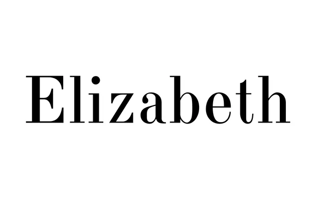
A high-contrast modern serif with 18th-century Russian character, digitised by Lyubov Kuznetsova at ParaType in 2001 from a lineage tracing back to the Ossip Lehmann foundry of 1904–07.
About
Rooted in the typefaces of the George Revillon foundry of the 1840s, Elizabeth carries archaic detailing drawn from Russian Academy of Sciences typefaces of the mid-18th century, giving it a period flavour unusual among modern serifs. Its sharp contrast and strong weight suit both text and display use in historical, literary and arts publishing. The typeface is particularly suited to Russian classical literature, and is named after Empress Elizabeth I of Russia (1709–61).
Classification
A high-contrast modern serif with archaic detailing, rooted in the Didone tradition via 19th-century Russian type foundries. The combination of sharp contrast and period-specific letterform choices places it firmly in the modern serif category with historical inflections.