 MegaMegaTypeType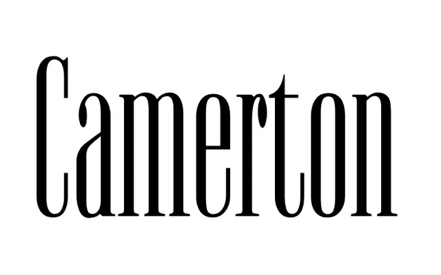
A tall, high-contrast condensed display serif designed by Alexey Chekulaev at Double Alex Font Studio in 1995, offered in seven styles.
About
The specimen shows pronounced stroke contrast between thick verticals and hairline thins, with narrow proportions suited to headline or display use. Seven named styles (A through G) suggest a range of weights or variations across the family. Designed in 1995, it carries the hallmarks of condensed display serifs intended for editorial contexts.
Classification
The specimen shows a tall, narrow serif design with pronounced stroke contrast and high-contrast thin hairlines, characteristic of a condensed display serif. The dramatic proportions and sharp serifs place it firmly in the display category.
Weights
ABCDEFG
Languages
Latin
Tags
condenseddisplayhigh-contrastserifdecorativemagazineeditorial