 MegaMegaTypeType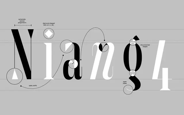
A high-contrast display serif built for large sizes, with an italic designed by Nina Botthof that brings expressive rhythm to its rigid structure.
About
Maurizio is a condensed display serif intended for headlines and large-scale use, where its razor-sharp serifs, open lobes and twisted dots become fully legible. The upright styles are rigid and precise; the italic, by Nina Botthof, introduces exaggerated end strokes in the lowercase that give it a distinctive cadence. Both styles are available as a variable font.
Classification
Display serif with razor-sharp serifs, open lobes, twisted dots and exaggerated end strokes in the italic. Condensed proportions. Italic designed separately by Nina Botthof.
Weights
Regular
Family
Maurizio Italic
Languages
Latin
Tags
displayserifcondensedvariablehigh-contrastitalian