 MegaMegaTypeType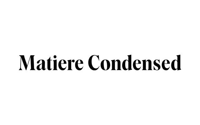
A high-contrast condensed display serif in six weights, pairing calligraphic stroke tension with precise contemporary construction.
About
Matiere Condensed is the narrow companion to Rellence's standard Matiere family, sharing six weights from Light to Super. The design merges sharp stroke contrast with calligraphic rhythm, lending it authority in luxury branding, packaging and editorial headline work. A variable font covering weight and width axes is also available for those who want finer control across the full family.
Classification
High-contrast display serif drawing on calligraphic stroke tension; upright only with no italic cuts; the condensed subfamily of the broader Matiere family, which spans standard and condensed widths plus a variable font with weight and width axes.