 MegaMegaTypeType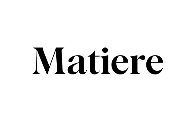
A high-contrast display serif fusing calligraphic stroke with contemporary precision, offered in six weights across standard and condensed widths with a two-axis variable font.
About
Matiere draws on calligraphic motion and mid-century references to produce a high-contrast display serif with what Rellence calls "brutal precision and elegant airiness." It runs six weights in both standard and condensed widths, backed by a two-axis variable font covering weight and width. The family suits branding, editorial, packaging and luxury contexts where typographic presence needs to hold at large sizes.
Classification
High-contrast display serif that blends calligraphic stroke qualities with contemporary geometric precision. Rellence describes the balance as "brutal precision and elegant airiness," drawing on mid-century design references. No italics; all styles are upright. Two-axis variable font spans weight and width axes.