 MegaMegaTypeType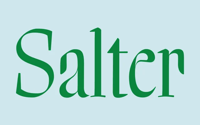
Lucas Sharp's single-weight display serif, rooted in mid-20th century book jacket calligraphy and built in homage to the lettering of Oscar Ogg and George Salter.
About
The roman is constructed on Oscar Ogg's methodology; the italic derives from a 1941 piece of lettering by George Salter. Blunt, chiselled edges and loose inky terminals carry the improvisational energy of calligraphic work into a systematised digital typeface. A strong choice for editorial headlines, book jackets and display work that needs period character without pastiche.
Classification
High-contrast display serif with calligraphic construction, drawing from mid-20th century book jacket lettering. The roman follows Oscar Ogg's construction methodology; the italic is based on a piece of lettering by George Salter from 1941. Blunt, chiselled edges and loose inky terminals are characteristic throughout. Single weight, two styles only.