 MegaMegaTypeType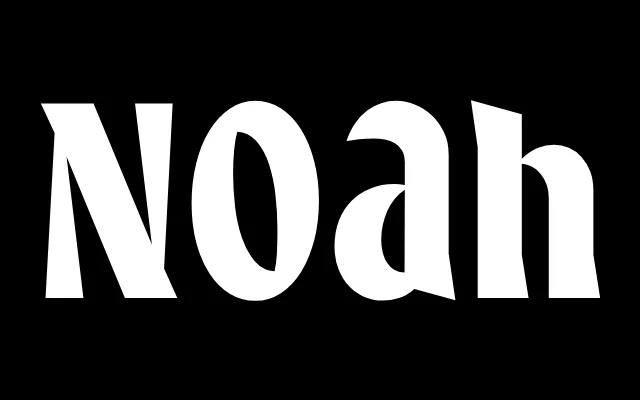
Display serif in three case variants, drawing on lettercutting traditions and mid-century book cover lettering.
About
Noah references the logic of lettercutting – carving with a chisel rather than painting with a brush – but adds an angular graphic quality beyond strict historical reference. It comes in three structural versions: Text, Unicase (where upper and lowercase share the same cap height) and Upper Lower (where uppercase is drawn as an enlarged lowercase). The Medium weight has something of Berthold Wolpe's Germanic seriousness; the Bold edges towards the expressive weight of Tom Carnese's Grouch.
Classification
Display serif referencing lettercutting and mid-twentieth century book cover design. Available in three structural variants: Text (standard case relationship), Unicase (upper and lower case at the same height) and Upper Lower (uppercase replaced by enlarged lowercase forms). The Medium weight has a Berthold Wolpe Anglo-Germanic quality; the Bold reads closer to Tom Carnese's Grouch.