 MegaMegaTypeType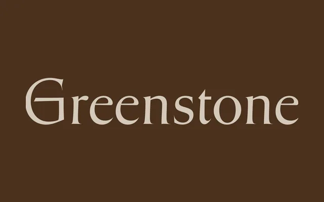
A lapidary display serif by Connor Davenport, drawing on Oscar Ogg's mid-century vernacular lettering and New England stone-carving tradition.
About
Greenstone bridges inscriptional precision with the fluid ductus of flat-brush calligraphy, producing a serif of unusual historic character. The Regular carries a near-imperceptible 2° slant and the Italic leans only 5°, with the more fluid construction of broad-nib penmanship. Large, flaring capitals and delicate expansive serifs give it a quality that reads as historically literate without feeling archaic.
Classification
Stone carving-inspired display serif with low-contrast horizontal strokes and high-contrast delicate serifs, drawing from flat-brush calligraphy and lapidary inscriptional lettering. Both cuts carry subtle forward slants – Regular at 2°, Italic at 5° – rather than a conventional upright roman and separate sloped variant. Large flaring capitals and expansive serifs give it a distinctive inscriptional weight.