 MegaMegaTypeType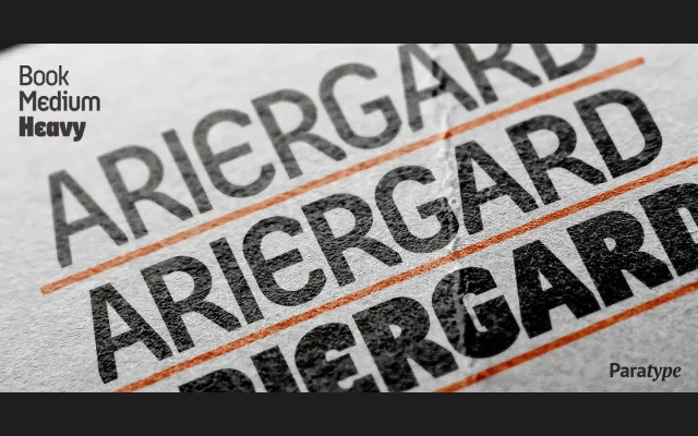
A three-weight display family drawing on archaic Cyrillic letterforms, designed by Oleg Karpinsky between 2000 and 2001 for advertising and poster use.
About
Ariergard employs sharp geometric construction while reviving historical Cyrillic conventions: the N retains a diagonal stroke, У and Ч are equilateral, and both lowercase г and т carry ascenders. These antique forms set it apart from contemporary geometric display faces. The family spans three weights – Book, Medium and Heavy – and is intended primarily for display and advertising contexts.
Classification
Sharp geometric letterforms with archaic Cyrillic letter shapes place this firmly in the display category. The revival of historical Cyrillic forms such as the diagonal-stroked N and equilateral У and Ч, combined with ascending г and т, give it an experimental, decorative character distinct from conventional geometric sans families.