 MegaMegaTypeType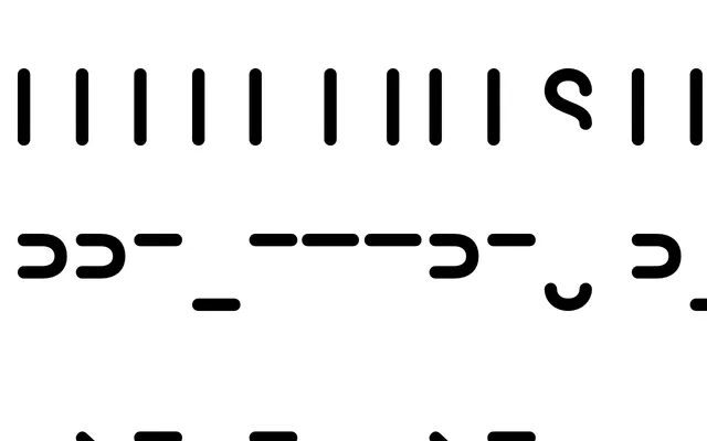
An experimental display typeface from Poem that draws on pre-alphabetic visual forms, offering a graphic and archaic quality suited to expressive typographic work.
About
Prelettres occupies a space between letterform and symbol, referencing proto-writing or pre-linguistic mark-making as its formal foundation. It is intended for display use where visual texture and conceptual weight take precedence over legibility at text sizes. The name itself signals the design's interest in what precedes conventional typography.
Classification
An experimental display typeface that appears to evoke pre-alphabetic or proto-writing forms, sitting outside conventional category boundaries but closest to display given its primary use as a graphic, expressive letterform rather than a text face.