 MegaMegaTypeType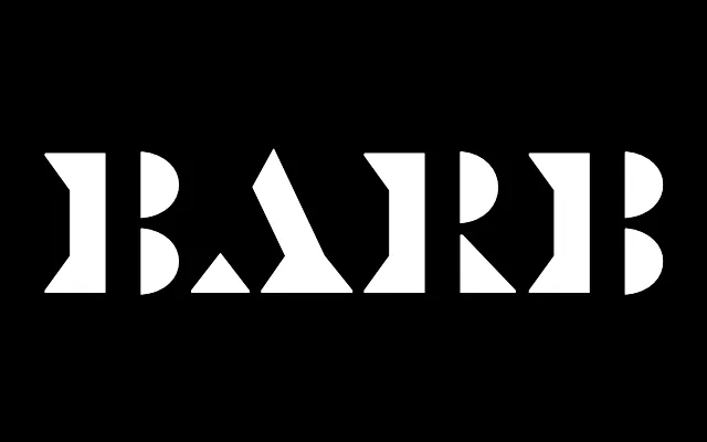
A display typeface assembled from separate graphic elements, producing unusual geometric connectors between strokes.
About
Barb builds each letterform from distinct graphic parts rather than cutting gaps into an existing design. The B, P and R combine scythe-shaped curves with triangular serifs; A, H and N feature pointed connector shapes where strokes meet. The approach borrows something from stencil typography in its separation of parts, but the aim is inventive construction rather than legibility-driven cutouts.
Classification
Display typeface built by assembling separate graphic components rather than modifying a unified design. Has some structural kinship with stencil type, but the motivation is construction rather than deconstruction. Triangular serifs and scythe-shaped curved strokes create unusual connector forms.