 MegaMegaTypeType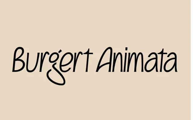
A tightly packed calligraphic face revived from Hans-Joachim Burgert's 1970s phototype experiments.
About
Narrow and wide letters sit shoulder to shoulder, so lines read with a pulsing, uneven beat. The spacing is deliberately aggressive, true to the hand-composed filmstrips it came from. It suits book covers, posters and titles that want a handmade, mid-century German press feel.
Classification
A digitisation of a 1970s phototype design by the calligrapher Hans-Joachim Burgert, built on his 'Achim-Kursive' rhythm of narrow and wide letters set very tight. Contextual alternates and discretionary ligatures carry the push-and-pull rhythm. Single style; modest character set of 246 glyphs.
Weights
Regular
Family
Burgert Animata Regular
Languages
Latin
Tags
calligraphicphototyperevivaltight-spacingrhythmicgerman1970sbook-cover