 MegaMegaTypeType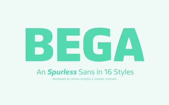
A spurless geometric sans in eight weights with oblique italics, designed by Diana Ovezea and Sabina Chipară for corporate and editorial applications.
About
Bega eliminates the entry strokes typically found at the top-left of letters such as 'm', 'n' and 'r', giving it a clean, rationally reduced appearance. Its proportional lining figures share the height of the capitals, while tall ascenders extend noticeably above the uppercase. The 16-style family suits branding, packaging and editorial contexts where a friendly but restrained voice is needed.
Classification
A spurless, monolinear-appearing sans serif with geometric reduction at its core. The elimination of spurs from characters like 'm', 'n' and 'r' places it firmly in the rationalist geometric tradition, though its friendly proportions and tall ascenders soften the overall effect.