 MegaMegaTypeType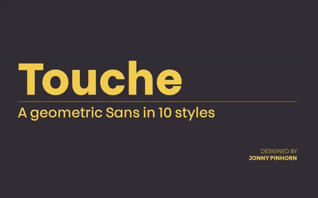
A geometric sans by Jonny Pinhorn that departs from convention through idiosyncratic details – elongated internal strokes, a topped J and a minimal lowercase j – while maintaining optical monolinearity across five weights.
About
Released in 2015 through Indian Type Foundry, Touche treats geometric sans conventions as a starting point rather than a constraint. The G and Q carry unusually elongated internal strokes, the S is drawn to hug its counter tightly, and the lowercase t retains an outstroke where other designs trim it away. All weights from Light to Bold remain optically monolinear, giving the family a consistent visual texture across sizes.
Classification
Optically monolinear letterforms across all weights place this firmly in the geometric sans tradition, though the designer departs from standard geometric conventions with elongated internal strokes and idiosyncratic details on several glyphs.