 MegaMegaTypeType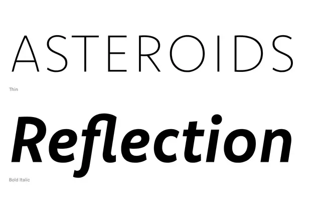
A sturdy, upright grotesque in eight weights with italics, drawing on classical English sans-serif forms while maintaining a livelier, more contemporary character.
About
Komet Pro's low stroke contrast, compact spacing and heavy dots and accents give it a near-monolinear quality across its 16 styles. The middle weights suit extended body copy, while the thin and black extremes carry enough presence for headline use. Round counters are generously open, and diagonals carry a subtle curve that softens the overall texture.
Classification
A low-contrast, upright grotesque with monolinear tendencies, drawing from classical English sans-serif models. Compact spacing and generous round counters place it firmly in the grotesque tradition with a contemporary sensibility.
Weights
ThinExtraLightLightRegularMediumBoldHeavyBlack
Languages
Latin
Tags
grotesqueeditorialbrandingcorporatemonolinearuprightworkhorsecontemporary