 MegaMegaTypeType
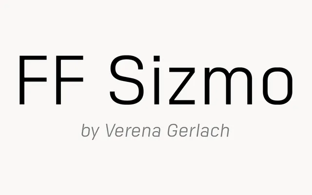
A plain-spoken industrial sans by Berlin designer Verena Gerlach, with a Line version whose letters sit on a continuous baseline rule.
About
FF Sizmo was inspired by the index boards in housing blocks, where white plastic capitals were fixed to a board along a thick line. The basic family is a sturdy, slightly narrow sans for interfaces, branding and wayfinding, and the Line styles bring back that board's rule as a strong graphic device for headlines and covers. Five weights with obliques.
Classification
Slightly condensed industrial sans with open counters, wide apertures and generous spacing, with oblique companions. FF Sizmo Line adds horizontal strokes along the baseline that join letters into a continuous line, with OpenType inserting start, middle and end pieces automatically.