 MegaMegaTypeType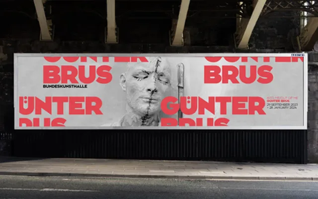
Originally cut in 1991 for the signage and identity of Bonn's Ausstellungshalle, and since carried into wider institutional use.
About
Bonn began as a commission for the Kunst- und Ausstellungshalle in Bonn, where the brief was legibility at architectural scale without the neutrality of a standard grotesque. The result tightens apertures and flattens terminals, producing letterforms that hold together when set very large and stay distinct when read across a hall. The BF release preserves the signage drawing while filling out the character set for general use.
Classification
A heavy grotesque drawn for signage, with tight apertures and flat terminals. Grouped as sans-serif rather than display because the family functions across sizes, though its weight distribution favours large settings.