 MegaMegaTypeType
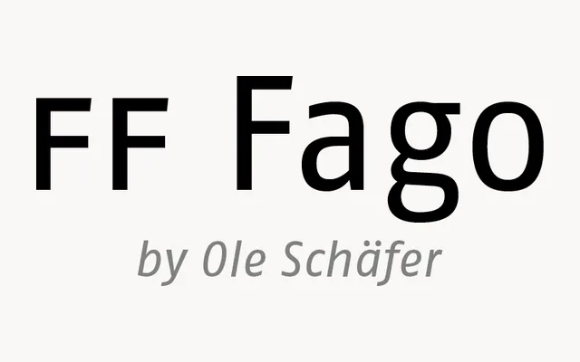
A corporate humanist sans by Ole Schäfer, released by FontFont in 2000 in three widths for large identity and signage projects.
About
FF Fago grew out of Schäfer's years on big corporate type jobs, and it shows in the breadth: five weights, three widths and real italics. A big x-height and open shapes keep it clear at small sizes and on signs, while a touch of contrast stops it feeling sterile. The Correspondence Sans cut tunes it for office documents and screens.
Classification
Corporate humanist sans with a large x-height, open forms and slight stroke contrast that hints at a roman. Five weights in Condensed, Normal and Extended widths with true italics; the Correspondence Sans version adds serifs to i, r and I for office use.
Weights
RegularMediumBoldExtraBoldBlack
Optical sizes and widths
CondensedExtended
Family
FF Fago Correspondence Sans
Languages
Latin
Tags
humanistcorporatewayfindingsignagebrandingworkhorse