 MegaMegaTypeType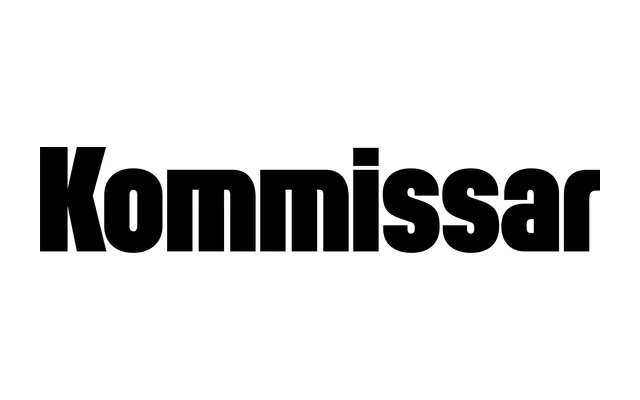
Designed for Fast Company's 2011 redesign, this condensed display family draws on Weimar-era German geometric faces to create a compressed rhythm suited to headlines.
About
Originally commissioned for Florian Bachleda's Fast Company redesign, it takes its cues from 1920s and 30s German display types such as Plak Condensed and Vertikal. The alternation of round and sharp corners, combined with the absence of notches in the arches, concentrates visual detail at the tops and bottoms of characters. Three width variants – Kommissar, Condensed and X Condensed – extend the family's range across editorial and typographic applications.
Classification
A condensed display face drawing on 1920s–30s German geometric display types such as Plak Condensed and Vertikal, characterised by a mix of round and sharp corners, archless notches, and a compressed structure suited to headlines.