 MegaMegaTypeType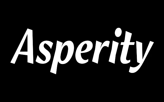
Angular display serif designed for AnOther magazine, the hard-edged version of a trio built on the same character skeleton.
About
Asperity was created for AnOther magazine issues 18 and 19 alongside Asphalt and Aspic – three typefaces with the same underlying character structure but different executions: angular, brushlike and painted respectively. Asperity is the hard version, using sharp geometric strokes that make its letterforms feel cut rather than written. Only Medium and Bold weights are available.
Classification
Angular display italic serif, the hard-edged member of a three-typeface set sharing the same underlying character structure. Asphalt is the soft, brushlike version; Aspic is the painted script. Asperity uses sharp, geometric strokes throughout.
Weights
MediumBold
Optical sizes and widths
Standard
Languages
Latin
Tags
displayangulareditorialmagazinehardgeometric