 MegaMegaTypeType
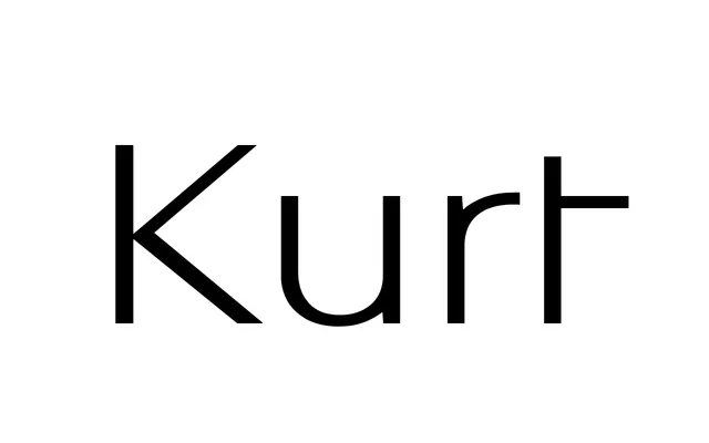
A light Swiss grotesk after Kurt Hauert's 1960s logotype for chaussures au centre and Basel posters of the 1950s.
About
Kurt draws on Hauert's logotype, a related study by his student Helmut Schmid and Fritz Bühler's posters for its capitals and figures. It belongs to the grotesks that came before Neue Haas Grotesk and Univers, with their contrast and tight joins: a striking s, a lopsided z, an a that wavers between stiff and organic. Light now, going up to ExtraBold.
Classification
A light grotesk with calligraphic contrast and very narrow joins, from 1950s and 1960s Basel and Zurich poster lettering.
Weights
Light
Languages
Latin
Tags
sans-serifgroteskswissrevivaldisplaybrandinglogotype