 MegaMegaTypeType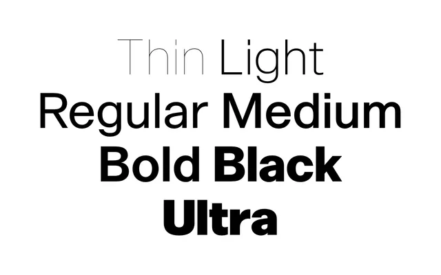
A seven-weight redrawing of Novarese's Forma that keeps its warm proportions and circular a, with a Cyrillic built on the same logic.
About
Anfalov started looking at Forma while studying at ECAL and rebuilt it from scratch, dropping the tapered stems and rounded corners that came from old production methods. Prima runs from Thin to Ultra on a one-style-fits-all principle: discreet in Regular for text, tight and compact in the heaviest cut for posters. The Cyrillic follows a westernised model informed by a 1980 sketch by Viktor Kharyk and L. Kolesnichenko.
Classification
A ground-up reinterpretation of Aldo Novarese's Forma: low contrast, tall x-height, a circular single-storey a and Forma's width play. The foundry describes it as a neo-grotesk jobbing typeface for text and display.