 MegaMegaTypeType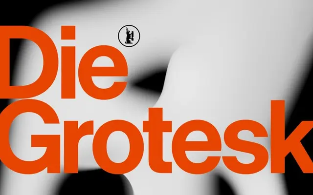
Klim's first retail variable font – a neo-grotesque in direct dialogue with Helvetica, built across four optical-size cuts and eight weights in roman and italic.
About
Designed by Kris Sowersby and released in 2025, Die Grotesk draws from original metal specimens of Neue Haas Grotesk and the rigour of modernist masters to engage Helvetica's legacy rather than sidestep it. Four optical-size subfamilies (A through D) provide purposeful spacing calibrated from dense body copy to tight display lockups, replacing crude tracking adjustments with precision engineered into the letterforms. A continuous weight axis (100–900) and optical size axis (6–42pt) give designers exacting control over typographic texture at every scale.
Classification
Modern neo-grotesque drawn in deliberate dialogue with Helvetica and Neue Haas Grotesk; informed by original metal specimens and Massimo Vignelli's tight-spacing approach to lockups and logotypes. Klim's first retail variable font, with continuous weight (100–900) and optical size (6–42pt) axes. Four discrete optical-size cuts (A through D) replace conventional tracking adjustments across body and display use.