 MegaMegaTypeType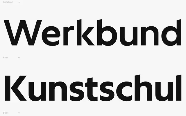
A geometric sans-serif family in two optical variants, drawing its conceptual tension from Paul Renner's humanised geometry and Wim Crouwel's system-driven experimentalism.
About
The Text subfamily softens its geometric structure through optical corrections to prioritise readability at smaller sizes, while the Display subfamily amplifies Crouwel's influence through cut edges and mechanical terminals. Both share the same underlying proportional skeleton, allowing them to work together across a single typographic system. The family spans six weights with matching italics in each subfamily.
Classification
Geometric sans-serif with optically adjusted forms for text legibility in the Text subfamily and more mechanical, system-oriented terminals in the Display subfamily, drawing explicitly from Futura and Wim Crouwel's Neu Alphabet as twin references.