 MegaMegaTypeType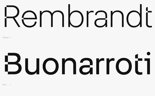
A neo-grotesque built on modular geometry drawn from Akzidenz Grotesk and Wim Crouwel's grid-based rationalism, softened by rounded terminals across three weights.
About
FH Lecturis takes the structural discipline of mid-century Dutch modernism as its foundation, referencing Crouwel's systematic approach to visual organisation and the workhorse clarity of Akzidenz Grotesk. Rounded terminals introduce a degree of warmth without compromising the underlying geometric rigidity. The family covers Light, Regular and Bold, with a Rounded variant extending the softer register of the base design.
Classification
Described explicitly as neo-grotesque, inspired by Akzidenz Grotesk and the rational grid systems of Wim Crouwel, with rounded terminals softening an otherwise mechanically ordered structure.