 MegaMegaTypeType
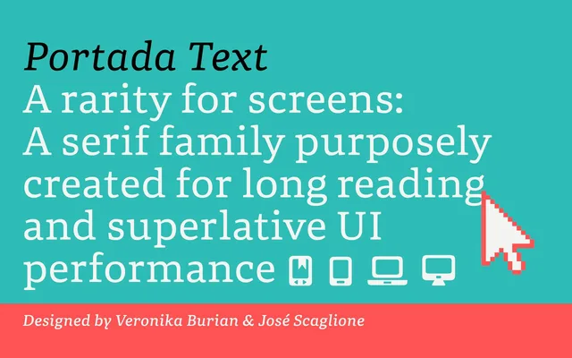
Portada's eight reading styles: a serif made to be as clear as a sans in apps, interfaces and long reading on screen.
About
Portada Text is the reading core of Portada, four weights from Book to Bold with italics, built for e-ink, small screens and app interfaces where serifs usually struggle. Sturdy serifs, wide proportions, a large x-height and clear counters hold up on coarse pixel grids. The italics carry a trace of calligraphy in their entry and exit strokes, and a free set of light and dark icons matches the family.
Classification
The text subfamily of Portada: a serif for long reading on screens and in interfaces, with sturdy serifs, wide proportions, a large x-height and open counters.
Weights
BookRegularSemiboldBold
Optical sizes and widths
Text
Languages
Latin
Tags
screenuiappeditorialdigitaltext