 MegaMegaTypeType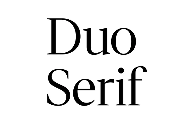
A sharply drawn transitional serif in 24 styles across Display and Text optical sizes, designed as the serif counterpart to KP Duo Sans with shared proportions.
About
Conceived as a digital-native update to the transitional serif tradition, KP Duo Serif prioritises high contrast and clean cuts over any reference to historical inkbleed or analogue texture. Six weights run across Display and Text subfamilies, each with matching italics, for 24 styles in all. The family shares metrics with KP Duo Sans, making the two directly interchangeable across editorial, long-form and branding contexts.
Classification
Described explicitly as 'a transitional serif, sharpened', it takes the high-contrast, upright axis and bracketed serifs of the transitional genre and strips away any ink-trap nostalgia, producing crisp, sharp letterforms optimised for digital screens.