 MegaMegaTypeType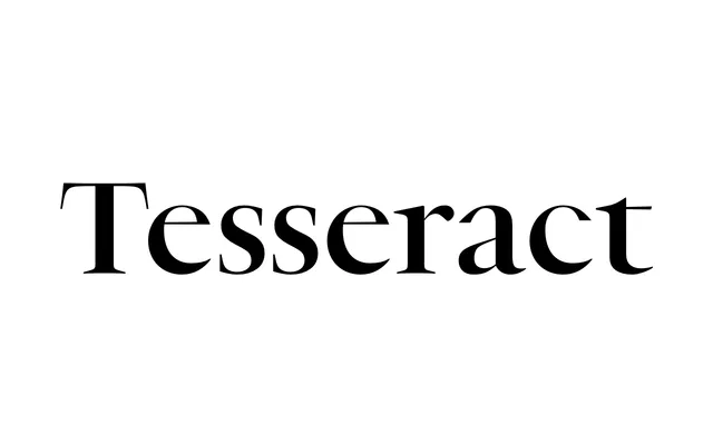
A Production Type serif in two optical sizes – Text and Display – that reconciles classical structure with sharpened, spiky terminals and constrained curves for both extended reading and titling.
About
Designed by Jean-Baptiste Levée and Marion Sendral at Production Type, the family pairs a sturdy Text cut built for immersive reading with a Display cut featuring wide apertures, a generous x-height and chiselled counterspace. The matching italics bring a staccato rhythm to both sizes. Latin and Cyrillic coverage spans 45 languages, with ten stylistic sets and a full suite of figure styles adding typographic depth.
Classification
A high-contrast serif with sharpened terminals and constrained curves, drawing on classical references while maintaining a distinctly modern sensibility through its spiky details and chiselled endings. Two optical sizes – Text and Display – each with matching italics confirm its classification as a contemporary serif optimised for both immersive reading and titling.