 MegaMegaTypeType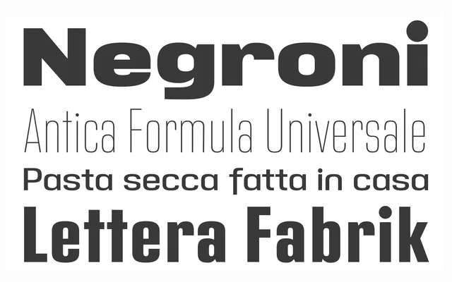
A mid-century grotesque built from 1950s German street-signage lettering, spanning seven weights in condensed, regular and extended widths.
About
Address Sans takes its bones from condensed German signage lettering of the early 1950s, then extends the idea across a full range of weights and widths in the manner of Butti and Novarese's work for 1960s Italian foundries. The result reads as confidently mid-century, at home in identity and editorial work that wants a period charm without looking dated.
Classification
Rooted in the condensed structure and block modulation of 1950s German street-signage lettering, giving it a mid-century grotesque character across a wide weight and width range.
Weights
ThinLightRegularSemiBoldBoldExtra BoldBlack
Optical sizes and widths
CondensedRegularExtended
Languages
LatinLatin Extended
Tags
grotesquemid-centurysignagebrandingcorporate