 MegaMegaTypeType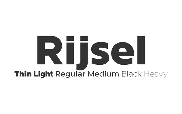
A six-weight corporate sans-serif designed for the headquarters signage of a large French industrial group.
About
Rijsel (the Flemish name for Lille) was designed in 2011 for the signage and graphic identity of a large industrial company's international headquarters, then extended in 2013 for wider release. Six weights from Thin to Black, with specific capital ligatures, give it a fairly complete corporate-branding range.
Classification
A six-weight sans-serif originally designed for a corporate headquarters identity and signage; a plain linear grotesque built for wayfinding and branding.
Weights
ThinLightRegularMediumHeavyBlack
Languages
Latin
Tags
sans-serifgrotesquecorporatesignagebranding