 MegaMegaTypeType
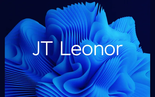
A broad geometric sans in ten weights with italics, modelled on Gotham and meant for headlines and running text alike.
About
JT Leonor is inspired by Gotham, as the foundry says, with wide capitals and round, open bowls. The thin and light weights are a touch squarer and the bold end a touch rounder, and the ten weights run all the way to a Heavy, with both a DemiBold and a SemiBold in the middle. It suits branding, signage and long runs of copy that want a familiar geometric voice.
Classification
Wide, open capitals, near-circular bowls and even strokes follow the American geometric model popularised by Gotham. The light weights lean square and the heavy weights rounder, but the structure stays geometric throughout.
Weights
ThinExtraLightLightRegularMediumDemiBoldSemiBoldBoldExtraBoldHeavy
Languages
LatinLatin Extended
Tags
geometricsans-serifbrandingheadlinetextsignagecorporatecontemporary