 MegaMegaTypeType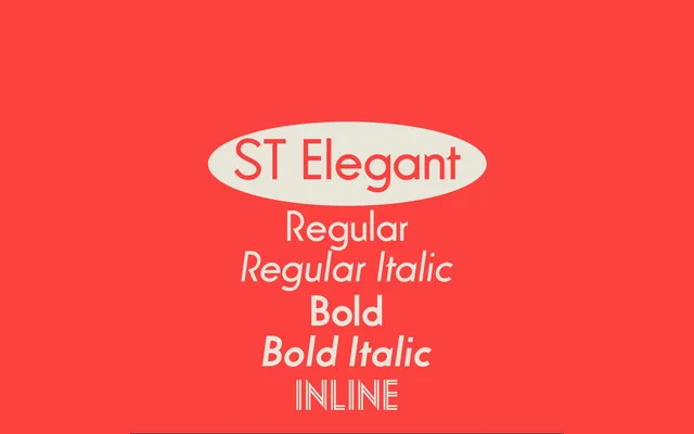
A five-weight digital revival of Hans Möhring's Elegant Grotesk (1928), redrawn for the Contemporary Art Centre in Nottingham with added weights and italics.
About
Originally commissioned by designer Sara De Bondt for the visual identity of a Nottingham contemporary art centre, the family traces its roots to Möhring's 1928 design for Schriftgiesserei D Stempel AG, distributed in Britain by Stephenson Blake as Guildford Sans. The characters were completely redrawn for the digital medium while retaining the original's tapering top-finials on vertical stems, and the family was extended with a new regular weight and two italic cuts absent from the source material. OpenType features include ligatures, alternate shapes and case-sensitive forms.
Classification
A digitised revival of Hans Möhring's Elegant Grotesk (1928), a geometrical sans with distinctive tapering top-finials on vertical stems, placing it firmly in the geometric grotesque tradition of the late Weimar period.