 MegaMegaTypeType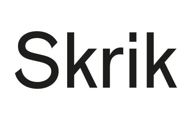
Arve Båtevik's grotesque for Store Norske Skriftkompani takes its name and spirit from Edvard Munch's Skrik, channelling the Venus–Ideal Grotesk–Grotesque 215 lineage through deliberate irregularities in proportion, curve tension and stroke endings.
About
Drawn from a study of Venus, Ideal Grotesk and Grotesque 215, Skrik preserves a period of grotesque development where construction was direct and functional yet less systematised than later sans-serifs. Its irregularities – shifting proportions, tense or squared curves, varying stroke endings – are not applied ornament but traits that emerged from that tradition. In text they recede into the overall rhythm, surfacing more insistently at larger sizes.
Classification
A grotesque sans-serif drawing from the Venus, Ideal Grotesk and Grotesque 215 lineage, characterised by shifting proportions, tense or squared curves and varying stroke endings that distinguish it from the more systematic grotesques that followed.