 MegaMegaTypeType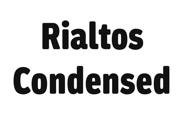
A condensed grotesque by Greg Lindy, inspired by the idiosyncratic charm of early 20th-century faces such as Venus and their application in the work of Piet Zwart and Blue Note Records.
About
Rather than a strict revival, Rialtos Condensed channels the broader visual language surrounding faces like Venus – the awkward warmth of pre-war German grotesks as seen through their most celebrated uses. Ten styles span five weights with matching italics, covering basic Latin and Latin Extended. The design brings a contemporary sensibility to these historical references without closely imitating any single source.
Classification
A condensed grotesque drawing on early 20th-century German grotesks such as Venus, with the characteristic warmth and idiosyncratic letterforms of that era. The condensed-only family reflects the application-first philosophy of those historical models.