 MegaMegaTypeType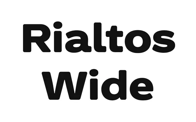
A wide grotesque in five weights with matching italics, drawing on the warmth and idiosyncrasy of early 20th-century faces such as Venus rather than mimicking their letterforms directly.
About
Rialtos Wide looks to the broader visual culture surrounding typefaces like Venus – from Piet Zwart to Blue Note Records – rather than simply reviving their specific forms. The result is a contemporary grotesque with period-inflected charm, available across ten styles spanning Light to Black with matching italics. Language support covers basic Latin and Latin Extended character sets.
Classification
A wide-cut grotesque drawing on early 20th-century Germanic grotesks such as Venus, with the characteristic quirks and warmth of that era. The wide proportions and five-weight range with italics align it firmly within the grotesque sans-serif tradition.