 MegaMegaTypeType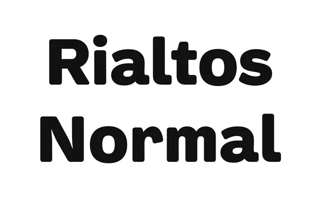
A contemporary grotesque drawn from the visual culture of early 20th-century European typefaces such as Venus, available in five weights with matching italics.
About
Rather than a strict revival, Rialtos Normal takes its cues from the broader application of pre-war grotesks, citing Piet Zwart and Blue Note Records as reference points alongside the typefaces themselves. Five weights from Light to Black each carry a matching italic, totalling 10 styles in standard OpenType and web formats. Coverage extends to basic Latin and Latin Extended character sets.
Classification
An early 20th-century grotesque revival, drawing explicitly from Venus and its contemporaries. The design reflects the characteristic warmth and irregularity of pre-war European grotesks, placing it firmly in the grotesque sans-serif tradition.