 MegaMegaTypeType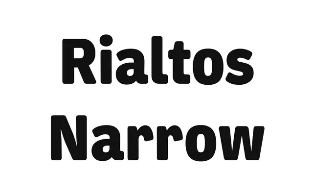
A narrow grotesque in five weights with italics, drawing on the charming awkwardness of early 20th-century German types like Venus rather than their precise formal qualities.
About
Greg Lindy's Rialtos Narrow takes its cues from the application of typefaces such as Venus – from the work of Piet Zwart to Blue Note Records sleeve design – rather than directly reviving their letterforms. The result is a condensed grotesque with period warmth that reads as contemporary. Ten styles cover Light through Black with matching italics, supporting basic Latin and Latin Extended languages.
Classification
A narrow grotesque drawing from early 20th-century German grotesks such as Venus. The design captures the warmth and slight idiosyncrasy of that period's types while translating them into a contemporary condensed sans-serif.