 MegaMegaTypeType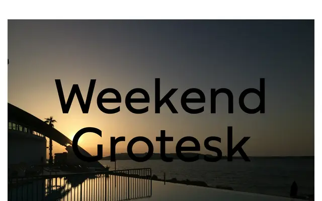
A three-weight display grotesque by Bernd Volmer with asymmetrical diagonal contrast and convex stroke ends that give it a deliberately off-kilter personality suited to branding and packaging.
About
Weekend Grotesk leans into eccentricity through its asymmetrical contrast on diagonal letters such as A and V, and its slightly convex stroke endings. Three weights – Regular, Bold and Black – form the current release, with the family still growing via Future Fonts. A Boost Legibility OpenType feature swaps in alternate forms of t, K and k to improve performance in longer text settings without losing the typeface's character.
Classification
A bold display grotesque with asymmetrical stroke contrast in diagonal letters and convex stroke ends, giving it an expressive, slightly eccentric character distinct from neutral grotesque conventions.