 MegaMegaTypeType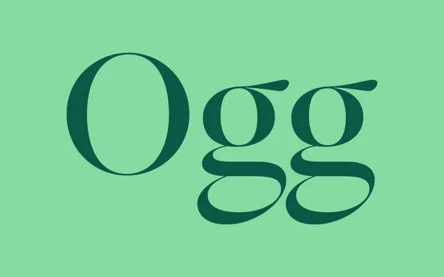
A high-contrast editorial serif by Lucas Sharp, rooted in Scotch Roman and transitional traditions, with ball terminals and strong stroke modulation across display and text optical cuts.
About
Ogg is a high-contrast serif by Lucas Sharp that takes its cues from Scotch Roman and late 18th century transitional types, translating their dramatic stroke modulation and ball terminals into a contemporary editorial voice. Six weights run from Light to Black, each with a matching italic, and a dedicated Text sub-family extends the family's range to continuous reading sizes. The result is a typeface that holds its personality at headline scale while remaining workable in longer passages, making it a consistent presence in magazine, fashion and cultural publishing contexts.
Classification
High-contrast serif drawing on Scotch Roman and late 18th century transitional sources. Distinctive ball terminals, tall x-height and dramatic stroke modulation carry across both display and text optical sizes. Italics are lively without being decorative. Closer in spirit to Miller or Scotch Roman No. 2 than to Didot or Bodoni, though the contrast level sits firmly in the modern camp.