 MegaMegaTypeType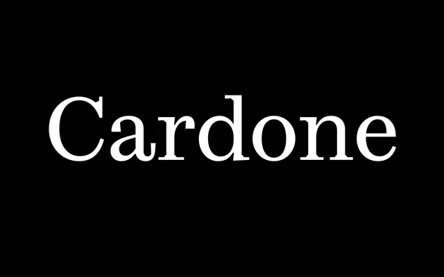
A Scotch Roman revival without the reverence: five independently drawn weights and a dedicated Micro cut, built for demanding editorial work.
About
Cardone takes the vertical stress, high contrast and ball terminals of early Scottish modern typefaces as its starting point, then departs from strict revival with bracketed serifs and softer transitions that hold up in continuous text. Fátima Lázaro spent five years developing the family at EsadType in Amiens, drawing each weight from scratch so that every style has its own distinct character rather than feeling mechanically interpolated. A Micro variant – leaner and more mechanical – handles text below eight points while remaining legible at display sizes.
Classification
Contemporary interpretation of early Scottish modern (Scotch Roman) faces. High-contrast, vertical-stress design with ball terminals, bracketed serifs and long tapered stems. Five weights drawn independently rather than interpolated. The Micro subfamily strips back detail for sub-8pt text, giving it a more mechanical, regularised character. Rich OpenType feature set including oldstyle figures, contextual alternates, fractions, stylistic sets for arrows, ampersand, numero and alternate J and Q forms.