 MegaMegaTypeType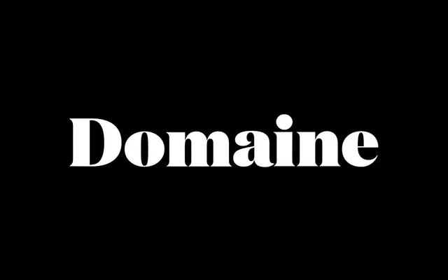
A sharp, high-contrast display serif by Kris Sowersby that fuses French and British typographic traditions into a contemporary voice, spanning six weights with matching italics.
About
Domaine Display was released in 2013 and draws on early 20th-century French and British serif traditions. Its gently bracketed triangular serifs, hooked terminals and calm horizontal head serifs give it a cool, precise elegance suited to editorial headlines and brand identities. The italics take their cue from Deberny & Peignot's Labeurs Ordinaires Série, adding a scholarly warmth to the roman's crispness. The family extends to Display Narrow, Display Condensed and a companion Text cut for body settings, making it a complete display system.
Classification
Modern Transitional/Latin. High contrast, sharp display cut with gently bracketed triangular serifs and distinctive hooked terminals. Klim classifies it as Modern: Transitional/Latin. The italics draw on early 20th-century French precendents (Deberny & Peignot's Labeurs Ordinaires Série) rather than strict historical revival forms.