 MegaMegaTypeType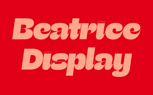
A high-contrast display serif built on the American Gothic tradition, using Sharp Type's Internal Contrast methodology to produce dramatic hairlines and cozy spacing designed for use at 60pt and above.
About
Designed by Lucas Sharp and Connor Davenport and released in 2018, Beatrice Display is the flagship optical size of the four-part Beatrice Superfamily, sitting above Headline, Deck and Standard in contrast and scale. Its Internal Contrast methodology draws simultaneously on expansionist contrast systems, inverted contrast and grotesque contrast behaviour, producing letterforms Sharp Type describe as instantly indelible. All eight weights ship with italics, and the face's finely wrought apertures and dramatic hairlines reward large-scale typesetting.
Classification
High-contrast serif built on the American Gothic tradition, employing Sharp Type's "Internal Contrast methodology" – a system that combines aspects from expansionist contrast, inverted contrast and the contrast behaviour of grotesques. Dramatic hairlines, finely wrought apertures and extremely tight spacing place it firmly in display-only territory; Sharp Type recommend 60pt minimum. The Display cut is the highest-contrast optical size of the four-part Beatrice Superfamily.