 MegaMegaTypeType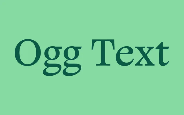
The text companion to Sharp Type's Ogg Display, translating Oscar Ogg's calligraphic hand lettering into a high-contrast serif calibrated for body copy across editorial and book contexts.
About
Ogg Text adapts the calligraphic spirit of Ogg Display for sustained reading, tempering the display version's extreme contrast through transitional and oldstyle text proportions. The design traces its character to 20th century book designer and calligrapher Oscar Ogg, whose technique of combining calligraphic stroke, contour drawing and white-out reduction informs the typeface's distinctive modulation. At text sizes it reads with warmth and rhythm, making it well suited to magazine body copy, long-form editorial and book setting where a calligraphic presence is wanted without sacrificing legibility.
Classification
A high-contrast calligraphic serif built as a text companion to Ogg Display. The structural framework draws from transitional and oldstyle text models – moderate x-height, bracketed serifs, diagonal stress – while the surface character retains the calligraphic stroke construction and ink-trap detailing of Oscar Ogg's hand lettering. Sits closer to the Zapf-influenced calligraphic-transitional tradition than to strict Baroque or Neoclassical models.