 MegaMegaTypeType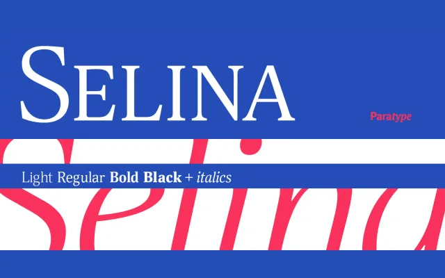
A low-contrast serif by Natalia Vasilyeva, offered in four weights with matching italics, a calligraphic italic with swash capitals, and an extended-width subfamily added in a 2016 update.
About
Designed in 2007, Selina targets both body text and display use through restrained stroke contrast that holds up at small sizes. The family spans narrow and extended proportions across four weights each, with matching italics, giving it considerable range for editorial and publication work. A single calligraphic italic style with swash capitals adds an expressive option within the otherwise functional system.
Classification
A low-contrast serif with narrow and extended width variants, calligraphic italic and swash capitals. The restrained stroke modulation and multipurpose character place it within the transitional-to-modern serif tradition.